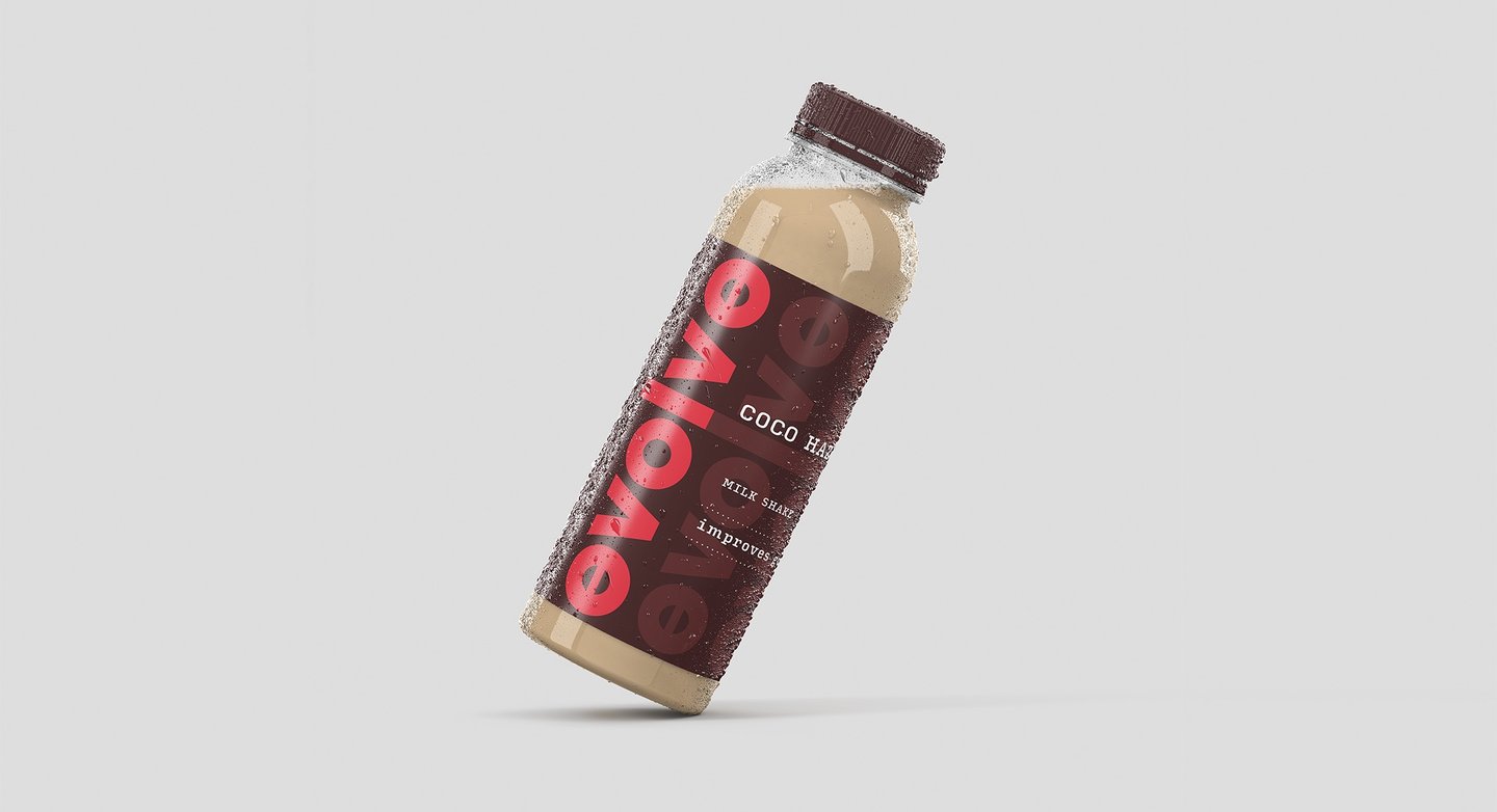
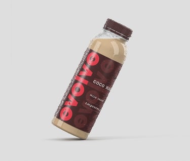
EVOLVE PACKAGING
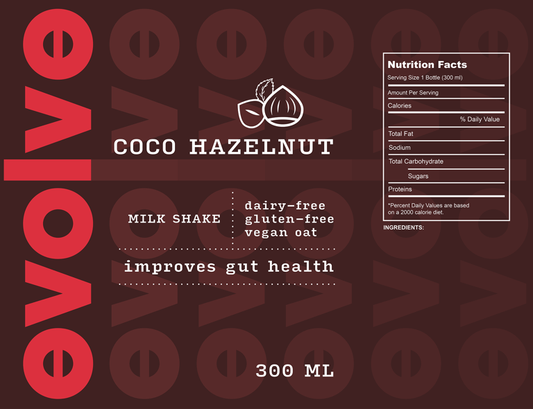
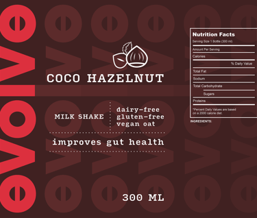
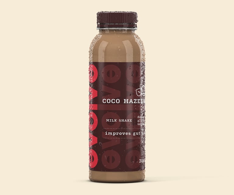
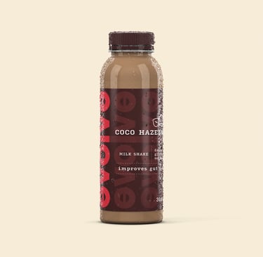
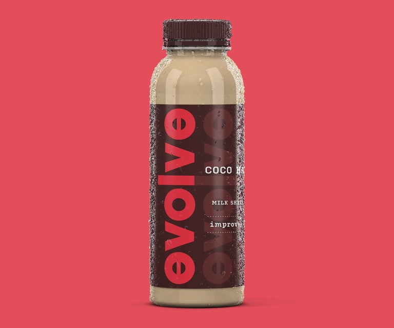
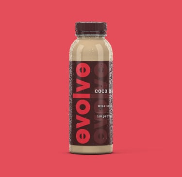
Evolve is a newly launched beverage brand. They specialise in vegan, organic milk shakes which promote gut health, and is targeted towards the health and environment conscious.
OUR VISION
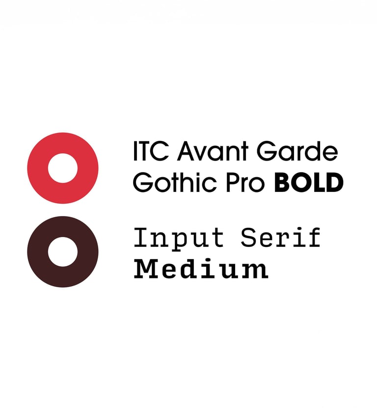
The Evolve logo was designed with intention and symbolism at its core. We crafted the letter ‘e’ as a continuous circle — a visual representation of balance, wholeness, and ongoing improvement, echoing the brand’s philosophy of steady, conscious growth. To further reinforce the idea of transformation, I introduced a subtle tint transition on the packaging label that leads the eye naturally to the bold, bright pink brand name. This contrast not only captures attention but also embodies the energy and forward momentum that the name Evolve suggests.
OUR MISSION
With the brand’s target audience in mind — individuals seeking wellness, simplicity, and mindful living — the overall visual language was kept clean, calm, and purposeful. The typography and imagery are minimal by design, avoiding unnecessary flourishes or visual noise. Every element is considered and deliberate, allowing the product to speak clearly and confidently. The result is a modern, eco-conscious identity that feels both refined and approachable, in alignment with Evolve’s commitment to health and sustainability.