KUSUMI BOUTIQUE

KUSUMI - (adjective, sanskrit) Blossoming
Kusumi is a boutique label specializing in Kanjivaram sarees, rooted in tradition and crafted with a bespoke sensibility.
As an all-women-owned brand, Kusumi values personal connection and thoughtful craftsmanship. Their identity reflects a fusion of the traditional and the contemporary—just like the modern Indian woman.
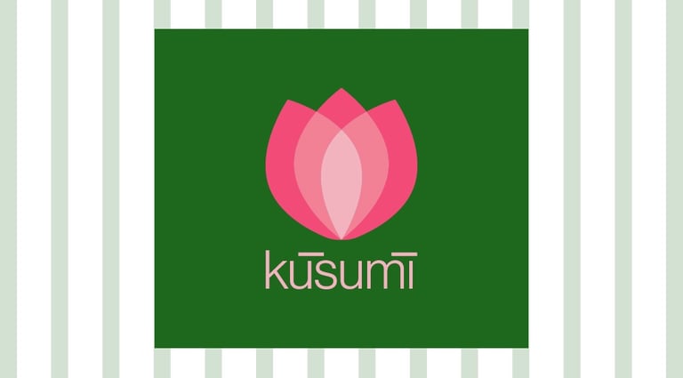
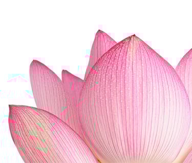
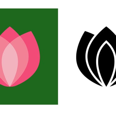
The saree remains one of the most timeless elements in an Indian woman’s wardrobe, symbolizing both heritage and grace. To echo this spirit, the lotus flower was chosen as Kusumi’s central motif. Elegant in form, resilient in nature, and graceful in bloom, the lotus captures the essence of femininity and strength—making it the perfect emblem for the brand.


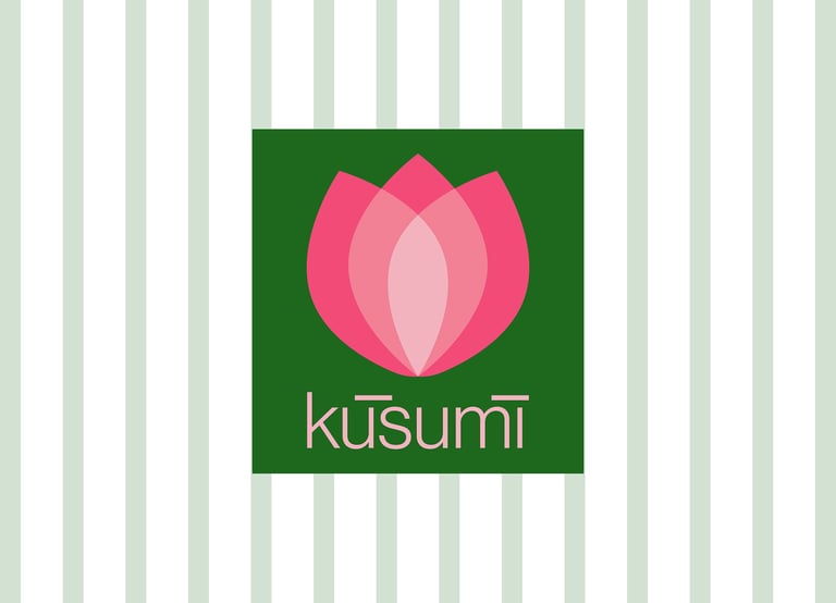

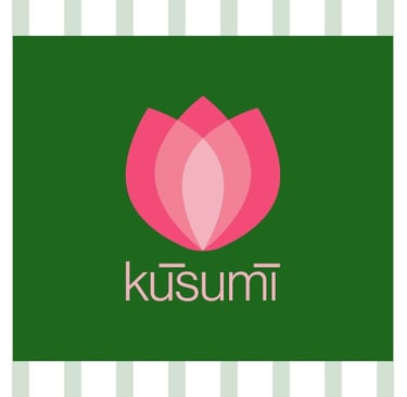
THE LOGO


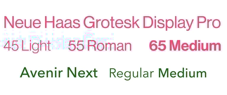


To highlight the brand’s modernity, I focused on a contemporary form for the logo, while the colour palette draws from traditional roots. The clean, flat lines evoke a sense of timeless elegance—balancing strength with grace.
The Kanjivaram saree, with its rich, heavy silk, is more than attire—it’s adornment. It becomes an extension of the woman who wears it. Whether she chooses to lead, nurture, explore—or embody all at once—the saree reflects her identity.
The chosen pink represents vibrancy and playful femininity, while the green pays homage to the fertile, abundant lands of South India—the birthplace of the Kanjivaram.
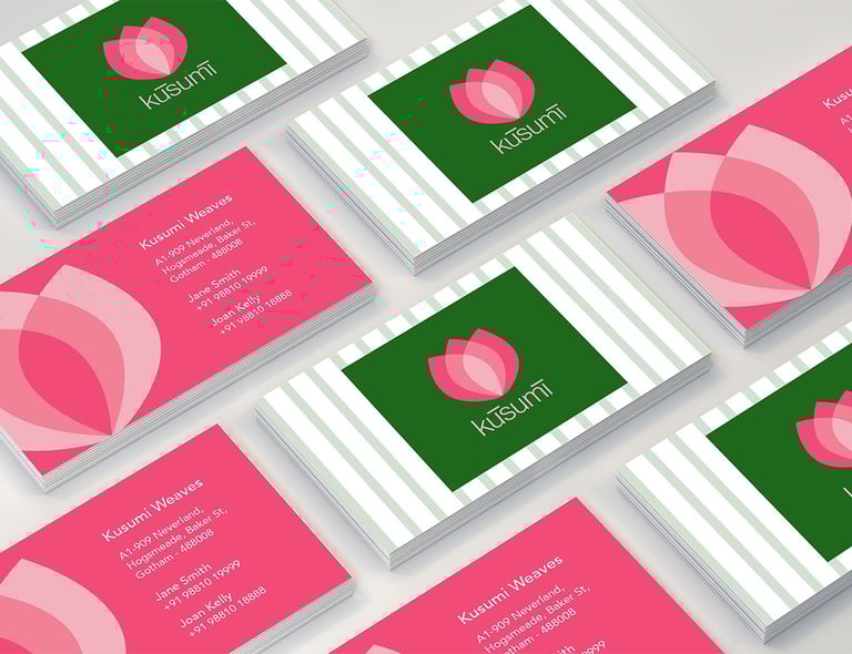
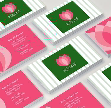
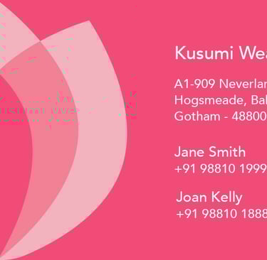
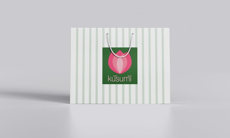
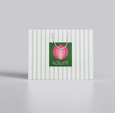
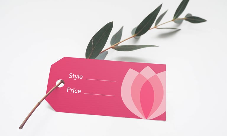
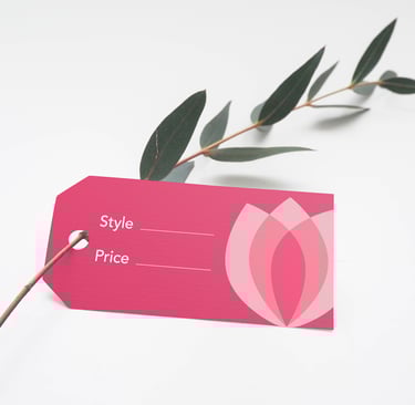
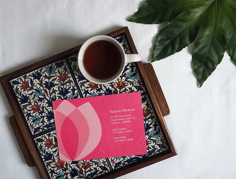
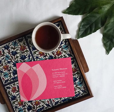
STATIONARY & PACKAGING
In addition to the logo and visual identity, I also designed print collateral for Kusumi, including business cards, a shopping bag, and saree price tags.